Packages used:
library(dplyr)
library(readxl)
library(ggplot2)
Data source: https://fantasydata.com/, uses non-ppr standard fantasy scoring
Read in Alvin Kamara and Mark Ingram 2018 data, both data sets are in same excel sheets but in different tabs. Kamara is on sheet 3 and Ingram on sheet 4. Use readxl package, and read_excel() function.
Kamara <- read_excel(akamara , sheet = 3)
Mark_Ingram <- read_excel(mingram, sheet = 4)
Using dplyr package filter games where A. Kamara had more than 0 rushing attempts and select following columns from dataset: player, week, and points. Do the same for M. Ingram.
Kamara <- Kamara %>% filter(attempt>0) %>% select(player, week, points)
Mark_Ingram <- Mark_Ingram %>% filter(attempt>0) %>% select(player, week)
Use dplyr to join the two data sets using function left_join, then create an additional column where it tells you for each week if M. Ingram played, then remove column “player.y”.
Kamara <- Kamara %>% left_join(Mark_Ingram, by="week") %>% mutate(Ingram_Play= ifelse(is.na(player.y), "Ingram not play", "Ingram played")) %>% select(-player.y)Summarize the data to display difference in fantasy points
Kamara1 <- Kamara %>% group_by(player.x,Ingram_Play) %>%
summarize(`total games`= n(),
`Average points`= mean(points)) %>% mutate(`Average points` = round(`Average points`,2))
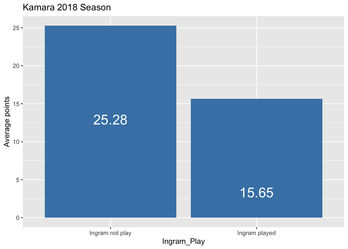
Kamara1## # A tibble: 2 x 4
## # Groups: player.x [1]
## player.x Ingram_Play `total games` `Average points`
## <chr> <chr> <int> <dbl>
## 1 Kamara Ingram not play 4 25.3
## 2 Kamara Ingram played 11 15.6Using ggplot2 package display data in bar plot.
Kamara2 <- ggplot(data=Kamara1, aes(x=Ingram_Play, y=`Average points`, title="Even")) +
  geom_bar(stat="identity", fill="steelblue") +
  geom_text(aes(label=`Average points`), vjust=10, color="white", size=7) +
  ggtitle("Kamara 2018 Season")
Kamara2