This tutorial will pull Covid-19 virus data by US County from New York Times.
Make sure correct packages are installed
if(!require(readr)) install.packages("readr", repos = "http://cran.us.r-project.org")
if(!require(dplyr)) install.packages("dplyr", repos = "http://cran.us.r-project.org")
if(!require(ggplot2)) install.packages("ggplot2", repos = "http://cran.us.r-project.org")
Load packages
library(readr)
library(dplyr)
library(ggplot2)
Read data into R
covid <- read_csv('https://raw.githubusercontent.com/nytimes/covid-19-data/master/us-counties.csv')Select my County, we will use Los Angeles as an example.
mycounty <- 'Los Angeles'Check make sure Los Angeles is part of the dataset, this will be a true or false.
mycounty %in% covid$county## [1] TRUEMaking a simple line chart
covid %>% filter(county==mycounty) %>% ggplot(aes(x=date, y=deaths, group=1)) +
geom_line()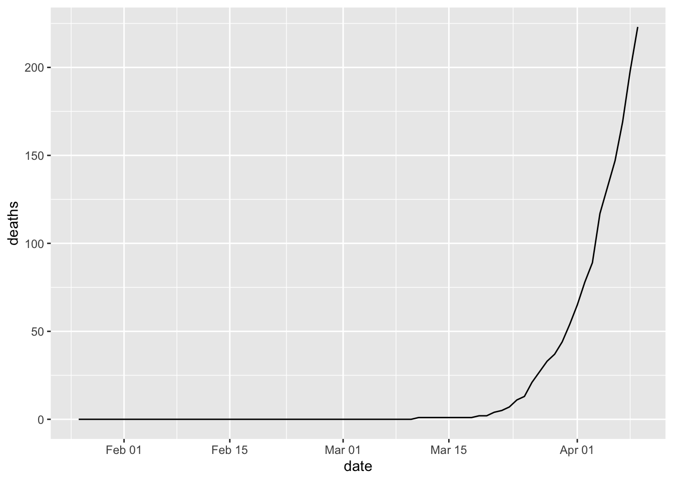 Create a more complex line chart
covid %>% filter(county==mycounty) %>% ggplot(aes(x=date, y=deaths, group=1)) +
  geom_line(linetype = "dashed", color = "red")+
  geom_point() +
  ggtitle(paste0(mycounty,' County Covid-19 Deaths Cumulative ',max(covid$date))) +
  geom_text(data=covid %>% filter(county==mycounty, date ==max(date)),
            aes(date,deaths,label=deaths),nudge_x = 2)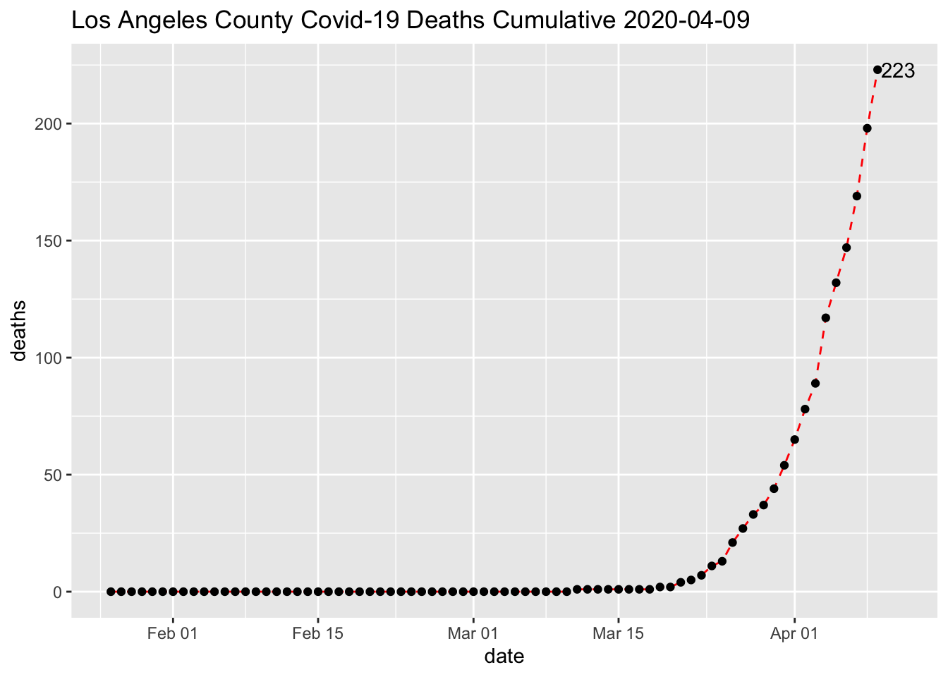
Latest day update
covid %>% filter(county==mycounty) %>% filter(date ==max(date))## # A tibble: 1 x 6
## date county state fips cases deaths
## <date> <chr> <chr> <chr> <dbl> <dbl>
## 1 2020-04-09 Los Angeles California 06037 7955 223